
We’ve been working on this set of keycaps for a good half a year now. It’s one of the most time-consuming projects we’ve taken as the work didn’t seem like it was a lot, but colour matching took a decade. Read more about it below.
Currently on sale till March
Hi, it’s Sam here – I am back to update you all on our keycaps. I know some of you might have seen sneak peeks of they development of these keycaps but we actually went through a lot of iterations to get the color correct. There was quite a lot that was learnt despite the task looking seemingly easy. “Just choose some colors and a font” – what can go wrong? Well a lot actually.
Okay, let’s dive into the nitty-gritty of our keycaps. Now, I know what you’re thinking – ‘It’s just a keycap, how complex can it be?’ But trust me, there’s more than meets the eye here.
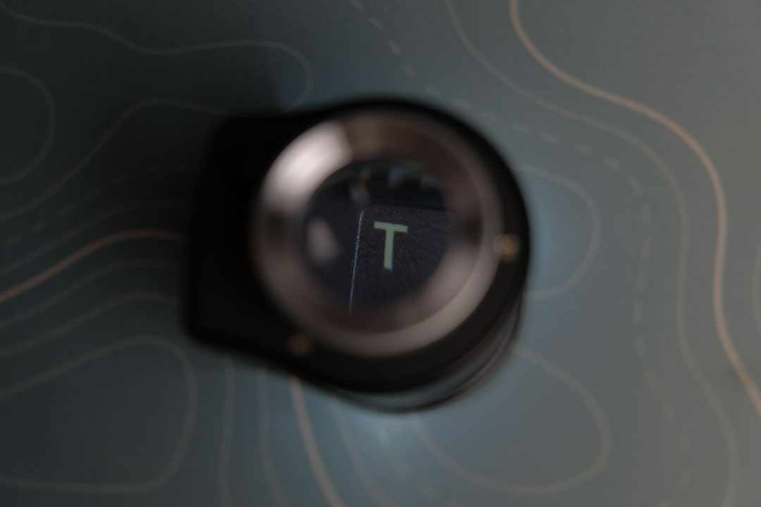
First up, the material. We’ve gone for a high-grade PBT plastic. Why PBT, you ask? It’s durable, resistant to the oils from your fingers, and doesn’t shine like your typical ABS caps. These keycaps are built to last and stay fresh, even during those long typing sessions.
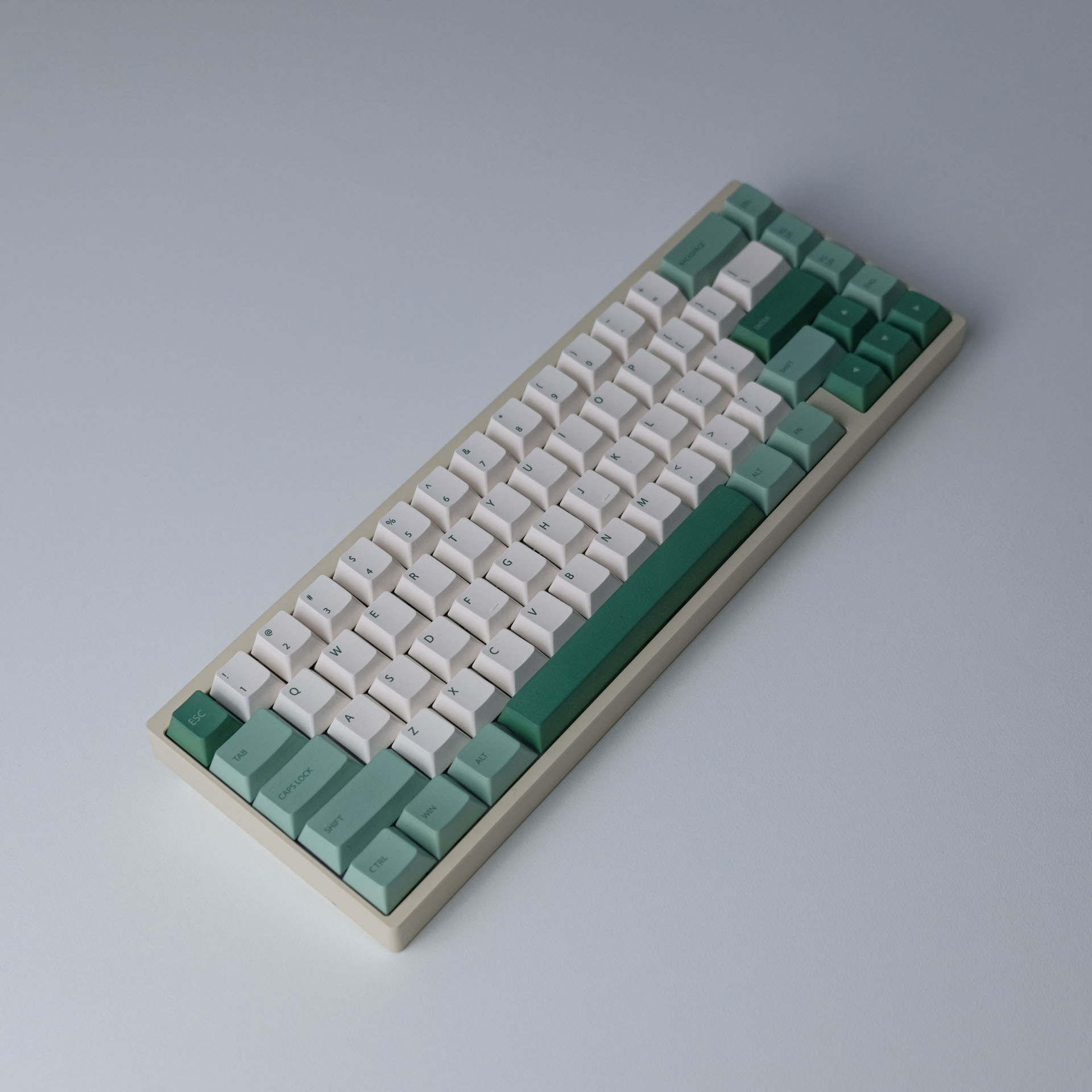
Now, onto the star of the show – the colors. Remember how I mentioned getting the color right was a bit of a journey? We didn’t just pick a few shades off a color wheel. Oh no, we mixed, matched, and tested a whole spectrum until we got the perfect balance. We chose some verify specific combinations of colour from the Pantone Colour Chips. The result? A palette that’s not only easy on the eyes but also makes your keyboard pop!
And fonts, oh the fonts! We didn’t just go for the run-of-the-mill Arial or Times New Roman. After much debate and a few coffee-fueled late nights, we settled on a clean, minimalist font that’s both stylish and super readable. Whether you’re a gamer, a coder, or just someone who appreciates a good typeface, these keycaps have got you covered.
So, there you have it – our keycaps in a nutshell. Crafted with care, designed with flair, and built for the long haul.
The project log is a comprehensive record, meticulously documenting each action and modification throughout the project’s lifecycle. It serves as an invaluable resource, offering clear insights into our decision-making process and the evolution of the project from concept to final product.
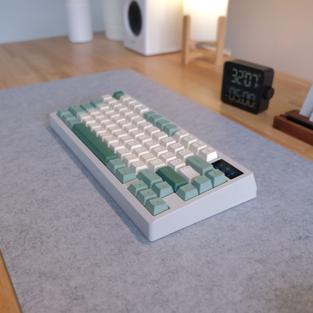
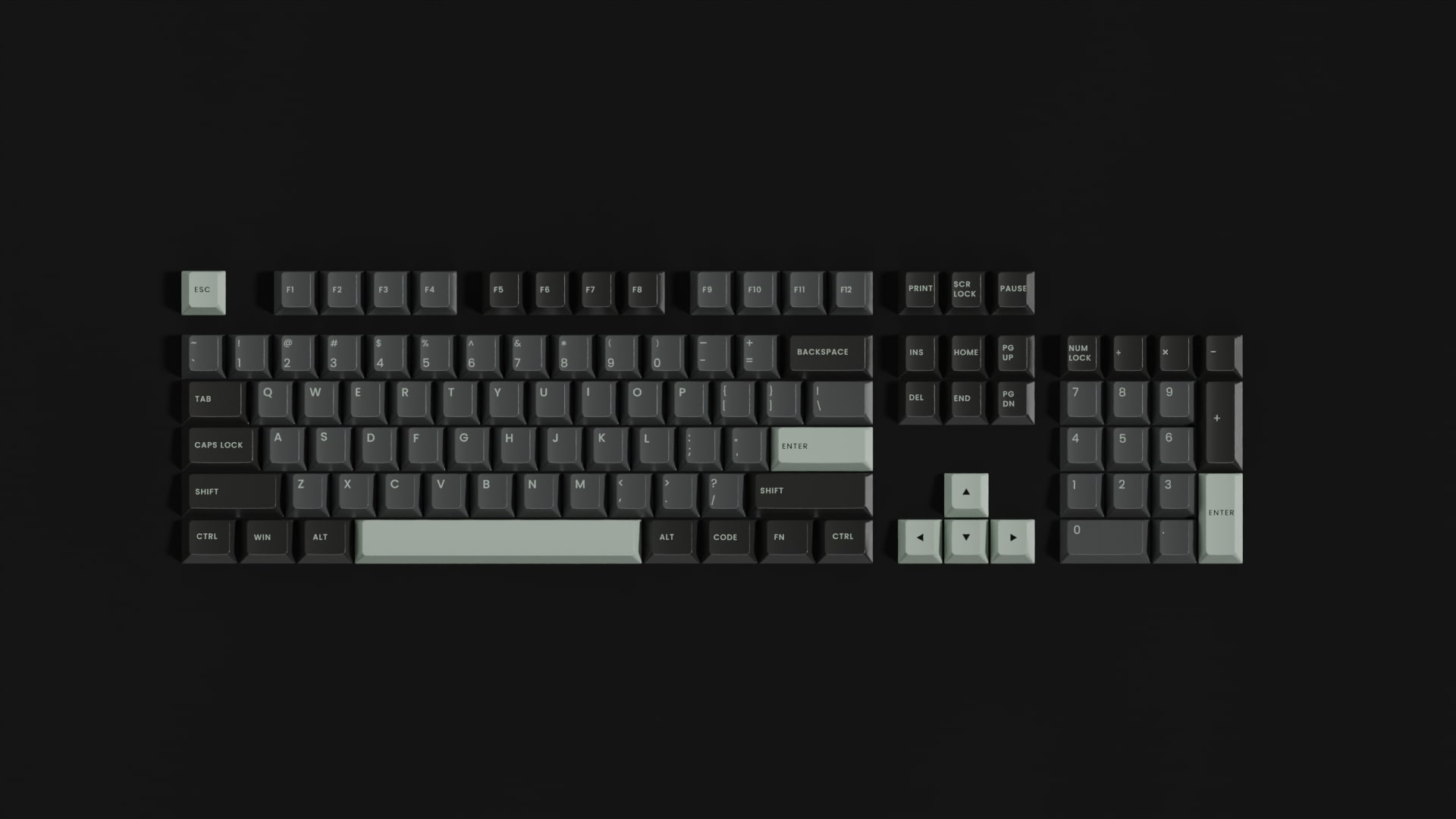
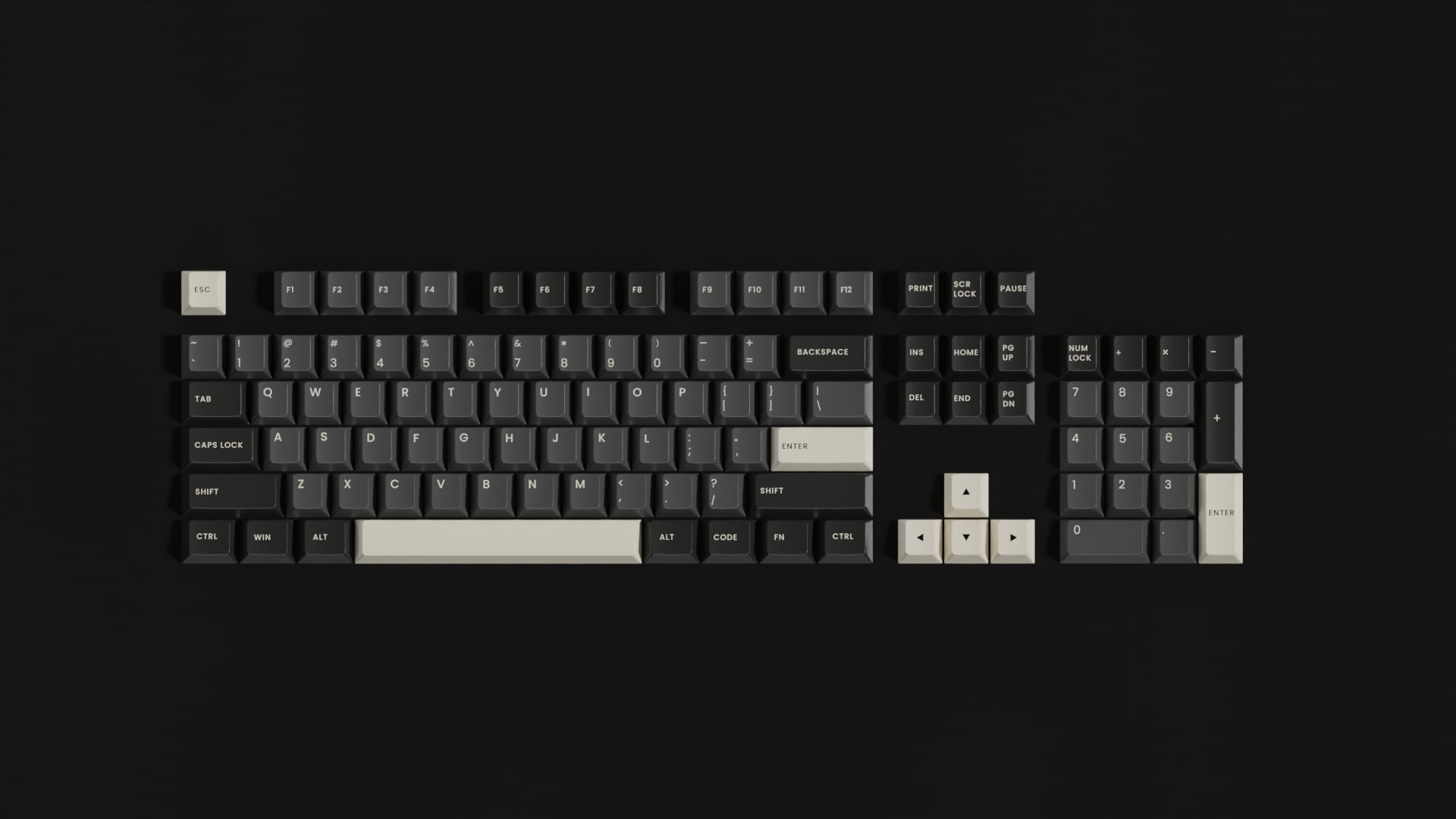
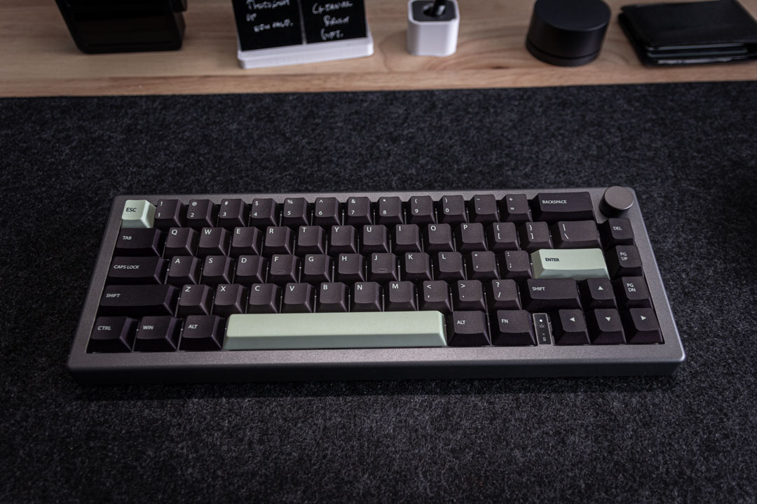
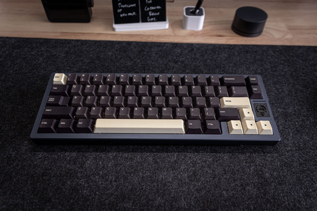
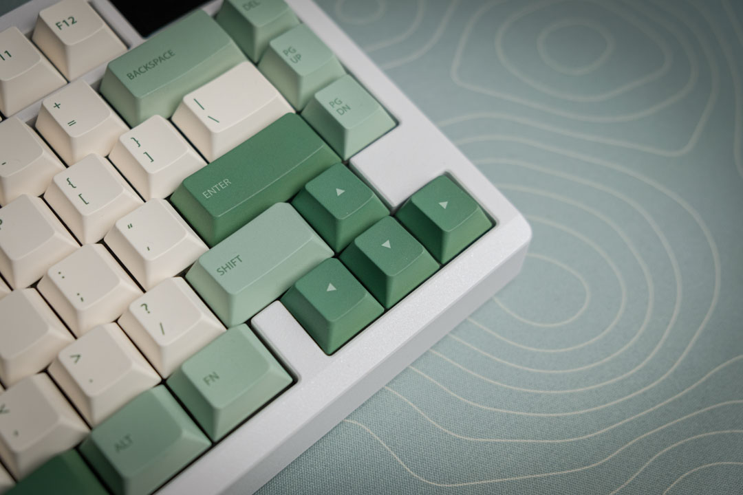
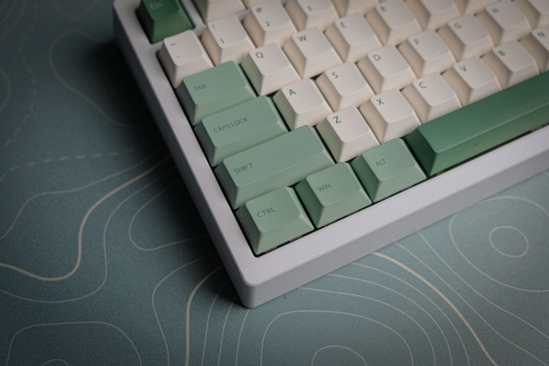
We set our sights on creating dark keycaps with vibrant accents, eyeing a sage green and a cream white combo. Right from the start, we knew Cherry Profile was the way to go. Luckily, the internet is a treasure trove of info on keycap design and rendering. So, we tapped into the Keycap Render Kit 2 in Blender to play around with different color combos. Here’s what we came up with in our initial two designs.
Below were our initial renders of the original colorway.
Hey everyone, just had an enlightening chat with our keycap supplier, and boy, did we learn a lot! We delved deep into the world of single-sided versus five-sided sublimation and really got to grips with what the process is all about. Turns out, this was the critical piece we were missing in our initial designs.
So, what exactly is sublimation in keycap land? Think of it as a fancy way to get designs onto keycaps. It’s not just any printing; it’s dye-sublimation, where the design doesn’t just sit on the surface but becomes one with the keycap. Here’s the breakdown:
Dye Application: We start by printing a design in reverse with this special ink onto transfer paper/plastic sheet.
Heat and Pressure: Next, this plastic shet gets cozy with the keycap under some serious heat and pressure. This turns the dye into a gas.
Infusion Time: This gas seeps right into the surface of the keycap (made of PBT plastic, because it’s just perfect for absorbing the dye).
Making it Permanent: Once everything cools down, the dye is permanently part of the keycap.
The big win here? These designs are longer lasting. The legends on the keycaps won’t fade or wear off because they’re deeply embedded in the material.
Now, let’s talk Single vs. Five-Sided Sublimation:
Given our design, single-sided was a no-go. We needed our lighter legends to pop on darker keys. So, we went all-in with five-sided sublimation to bring our design to life and push it into the sampling phase. Stay tuned for more updates!
After a few weeks of anticipation, our first sample finally arrived. Firstly, I must say, our supplier did a fantastic job with the quality of the keycaps; the feel and sound were spot on. But what about design fidelity, especially the colors? That’s when we stumbled upon another limitation of sublimation.
When it comes to black or dark keys, they tend to take on a hue of purple. Sublimation, essentially an ink transfer process, relies on CMYK colors (Cyan, Magenta, Yellow). Under certain lighting, our dark grey keys appeared chocolate brown, and our black keys showed slight hints of purple.
We also noticed some minor warping on the space bar, but we later realized this was within normal tolerance levels. In fact, most other keycap sets, including GMK sets, exhibit a similar degree of warping on their space bars. So, that turned out to be a non-issue.
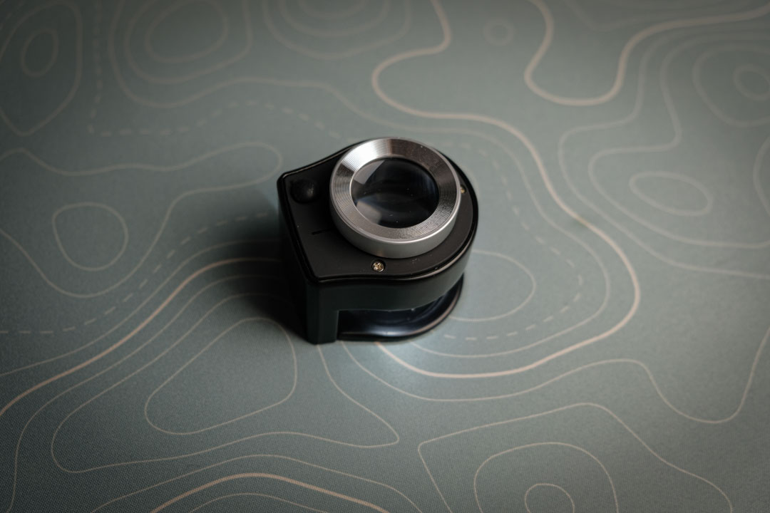
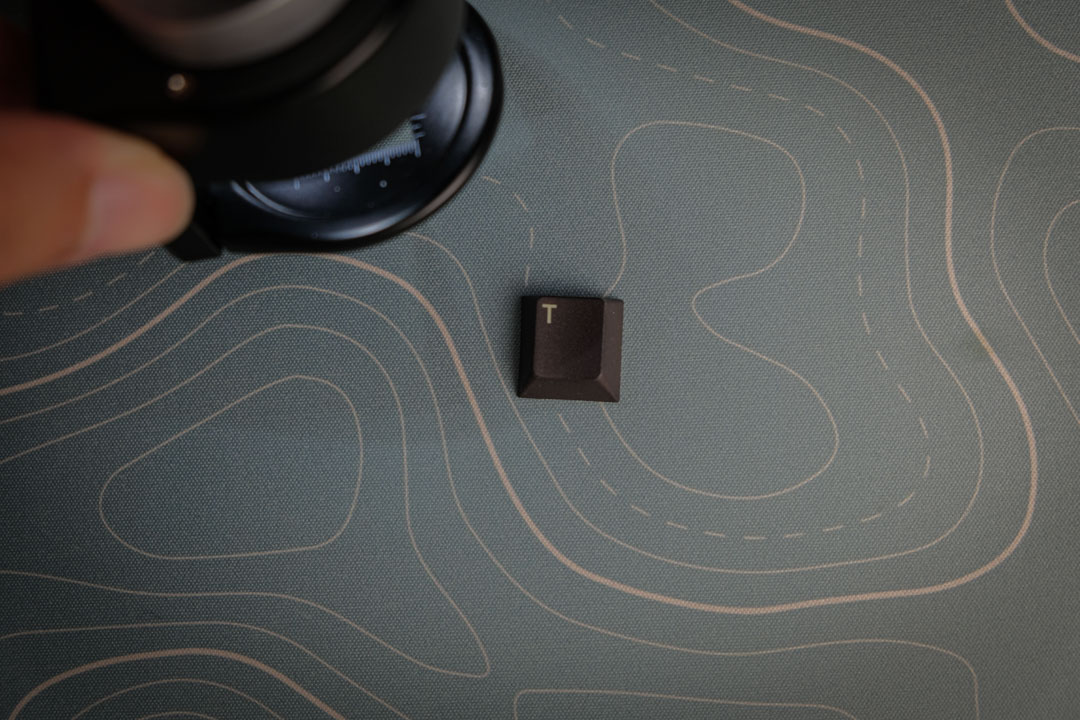
To inspect the keycaps we purchased this 30x magnifcation scope to check the sharpness of the text. It turned out pretty sharp and was inline with our expectations.
Knowing that colours were going to be an issue, we took a few month off researching and acquring as many other keycap sets as possible. Just to see what the texture quality is like and what they sound like, along with the color combos.
We opted to use single sided sublimation on alphabetical key and five sided sublimation on our modifiers (alt/fn keys) and our accent keys.
We acquired a set of pantone cards to help us with this iteration of the design.

We decided to drop the cream version for the time being and come back to it earlier next year and spend our time getting the green correct.
We wanted a clean green with a bit poppiness but as kenny(co-founder) described it, he didn’t want the green to feel “swampy” and my translation of that is he wanted less yellow in it and more blue to make the composition of the green. We used our pantone card and settled on the following design.

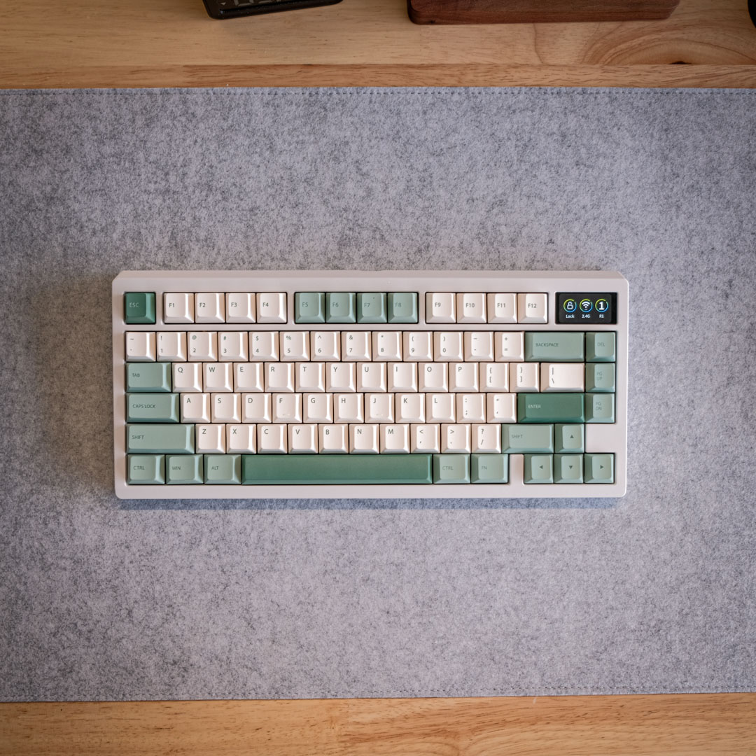
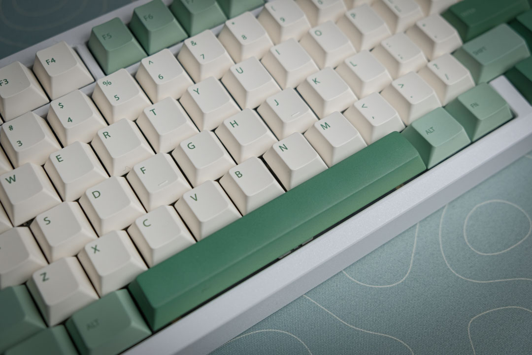
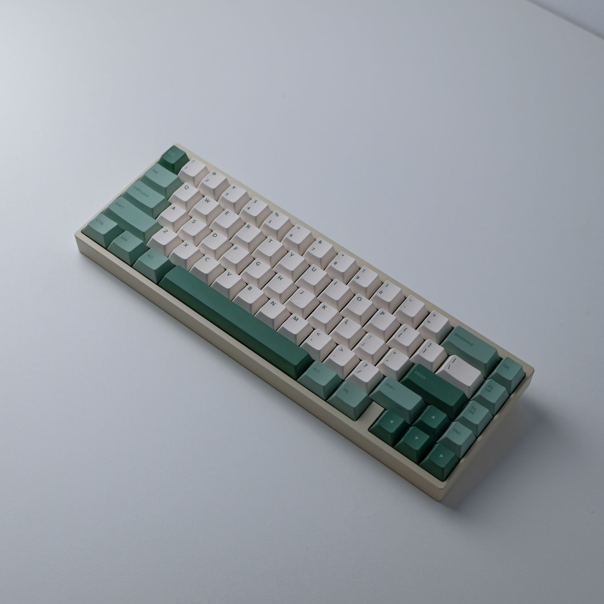
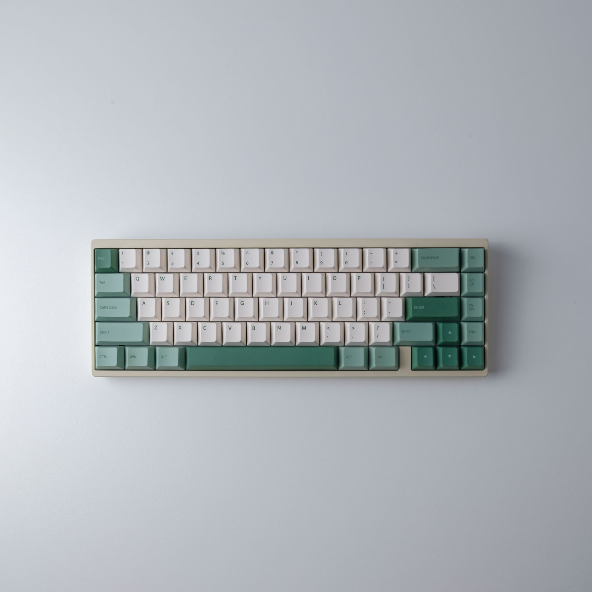
This one is perfect. The colours are as expected, the suppliers managed to colour match it to the exact pantone cards we’ve selected.

The sharpness was unparrelled for a dye-sublimation based keycap set.

Exciting news! After a journey filled with design tweaks, color tests, and quality checks, we’ve finally nailed down our product and its packaging. They’re not just good; they’re exactly what we dreamed of. But before we go full steam ahead, we’re stepping into the Interest Checking phase. This is where you come in! We’re keen to know who’s as excited about these keycaps as we are. By filling out the form below, you can register your interest.
Product has now been released as of 27th Jan 2024.
Copyright 2024 © Minimal Desk Setups. Proudly based in Melbourne, Australia.